Digital Transformation at Harbour Energy Indonesia
Harbour Energy's web applications faced challenges with outdated UI, inconsistent user flows, and poor navigation. By implementing a unified design system, simplifying user flows, and improving navigation, the redesign enhanced usability, increased task completion rates, and sped up onboarding. User feedback showed 80% found the new interface more intuitive, and 70% were satisfied with the improved navigation.
Date
Nov 2024 - Dec 2024
Role
Product Owner & Product Designer
Company
Starting the Transformation Journey
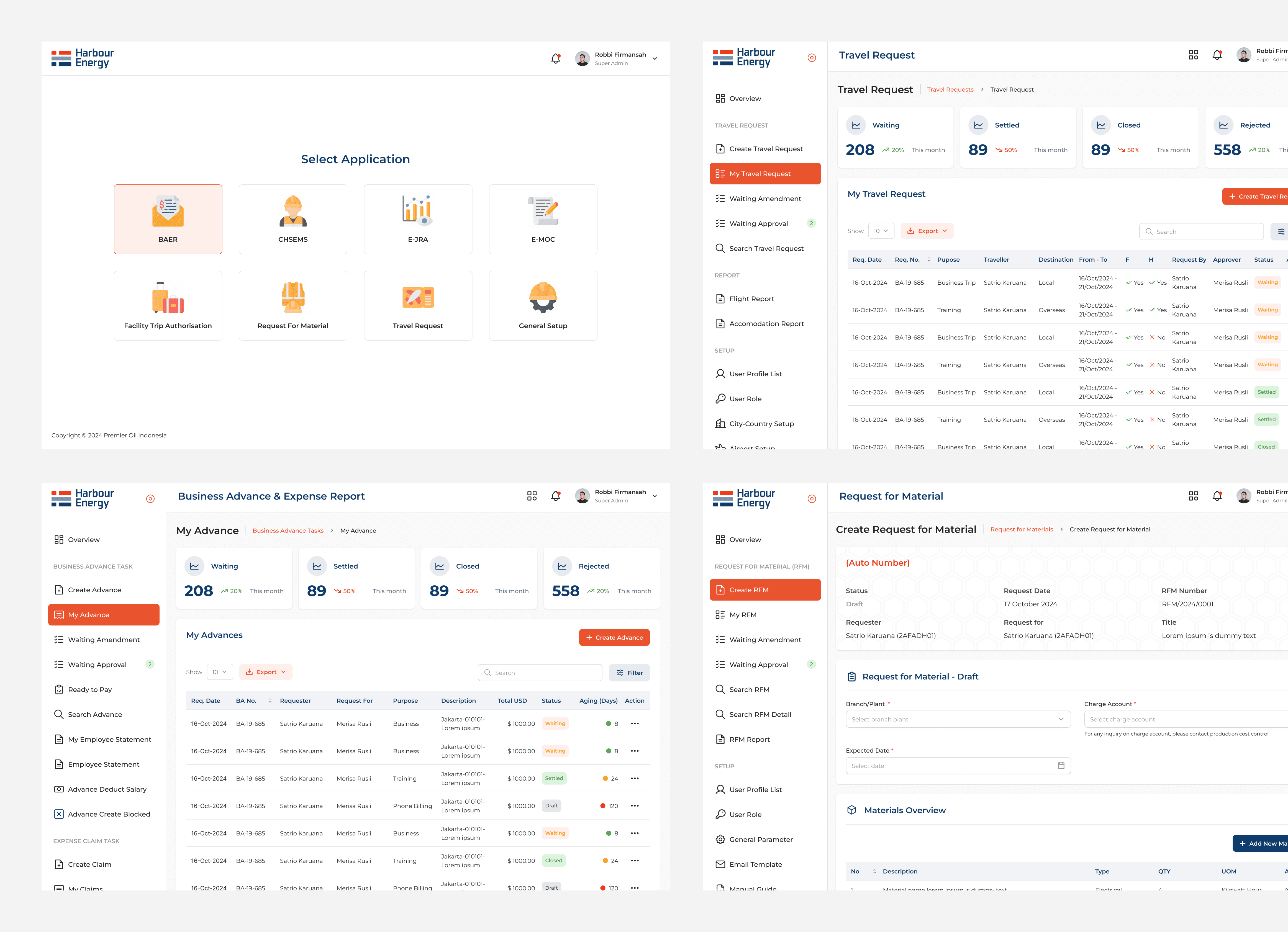
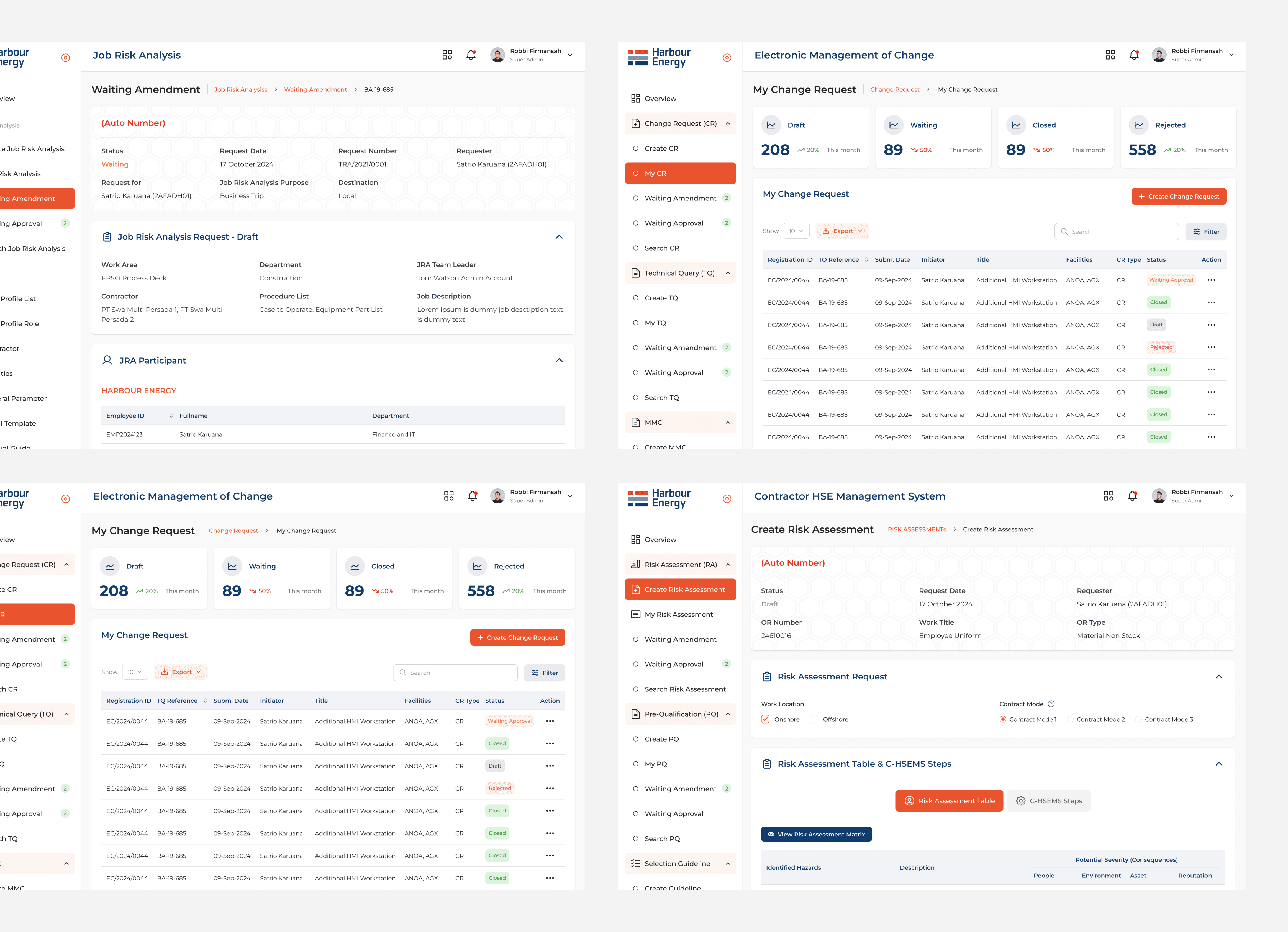
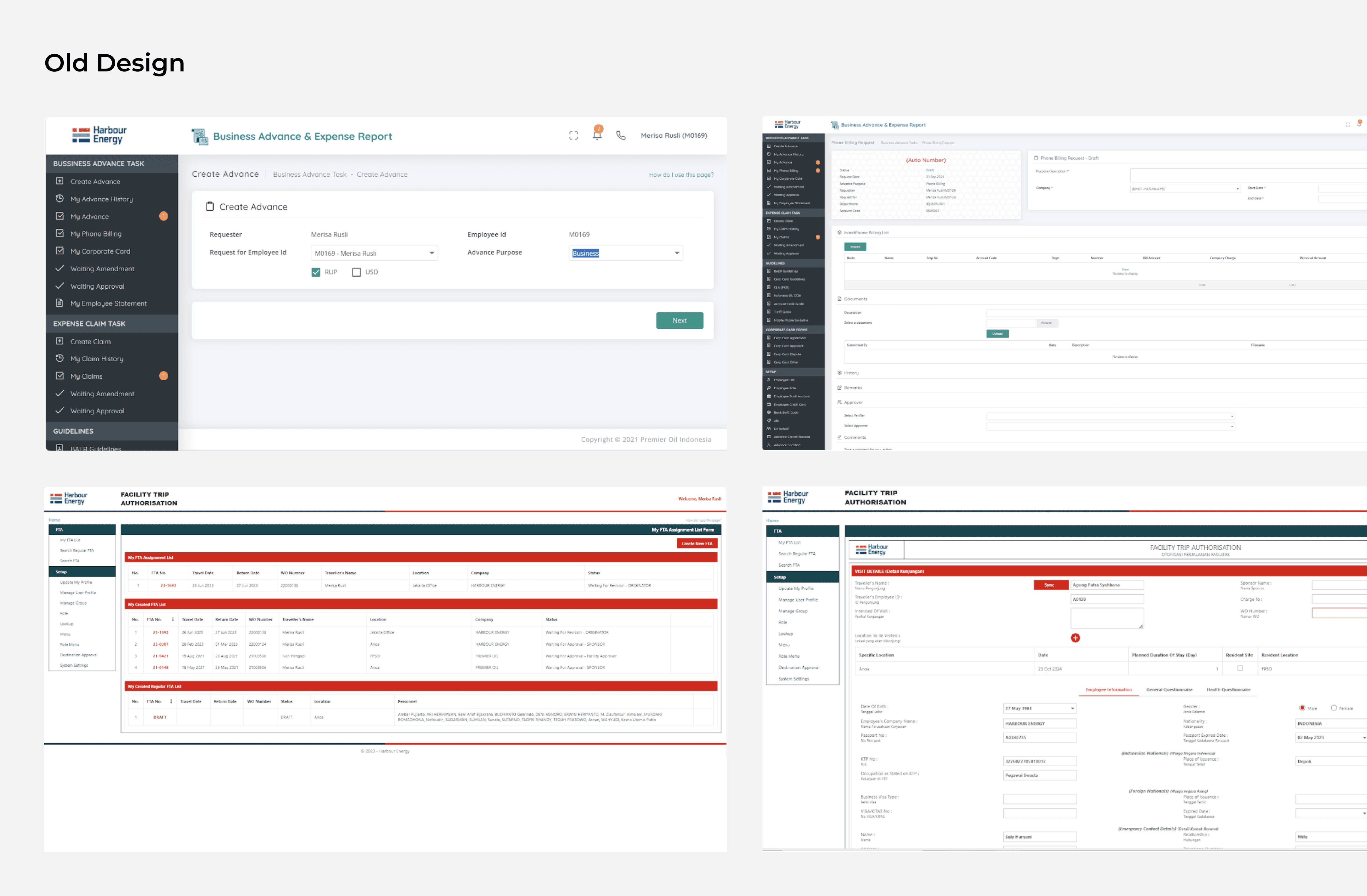
When I first joined this project, Harbour Energy Indonesia had nine different web applications used across various divisions. However, a recurring issue emerged in every user conversation: inconsistent design and workflow. Each application was developed by a different vendor, resulting in a lack of uniformity in both appearance and user experience. As a result, users often felt confused and struggled to complete their tasks efficiently.
As the Project Owner and Product Designer, my role was to bring consistency in design and user experience. I needed to ensure that every application had a modern interface, an intuitive workflow, and a system that enhanced user efficiency.
Challenges Faced
KEY ISSUES IDENTIFIED
Harbour Energy’s web applications had been developed by different vendors over time, leading to varying designs and inconsistent user flows. The key challenges included:
Outdated User Interface – The web applications had old, inconsistent designs that were not user-friendly.
Inconsistent User Flows – Different platforms had separate flows, causing confusion for users who had to work across multiple systems.
Inefficient Navigation – Users often struggled to find what they needed due to poor navigation structure.
Lack of Standardization – There was no overarching design system, leading to inefficiencies and design inconsistencies.
SUPPORTING DATA
30% of users reported difficulty navigating between platforms.
45% of users found the outdated design elements confusing and unappealing.
The Journey Toward a Solution
1. Understanding User Needs
The first step was to deeply understand user requirements. I conducted:
User Interviews → Engaging with users from different divisions to understand their pain points.
UX Audit → Identifying friction points in each application’s user experience.
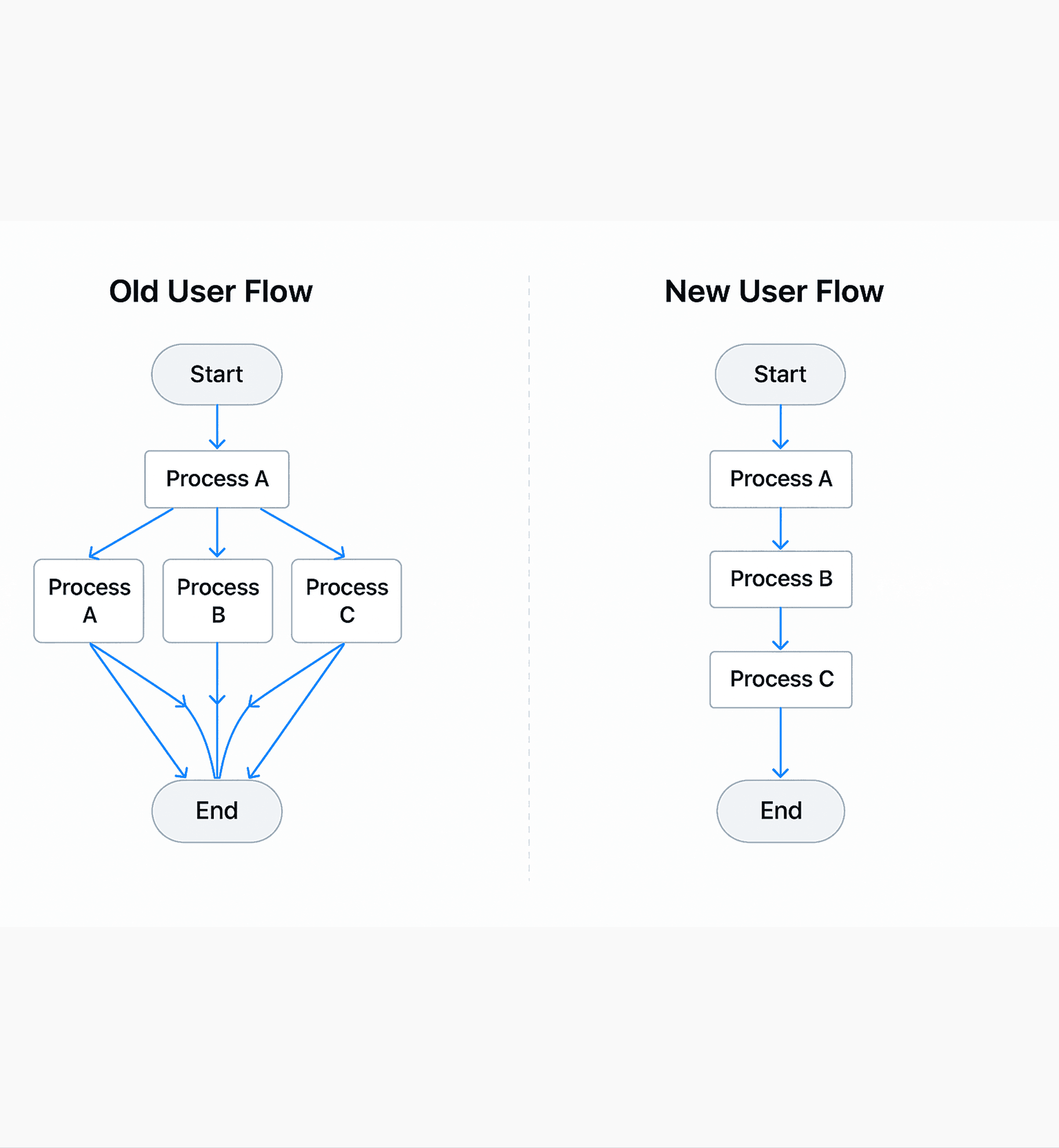
Flow Mapping → Visualizing workflow differences and finding the best way to unify them.
The outcome? I identified common patterns that served as the foundation for a new design system. By creating a standardized system, I was able to reduce task completion time by up to 30%.
2. Establishing a Design Standard
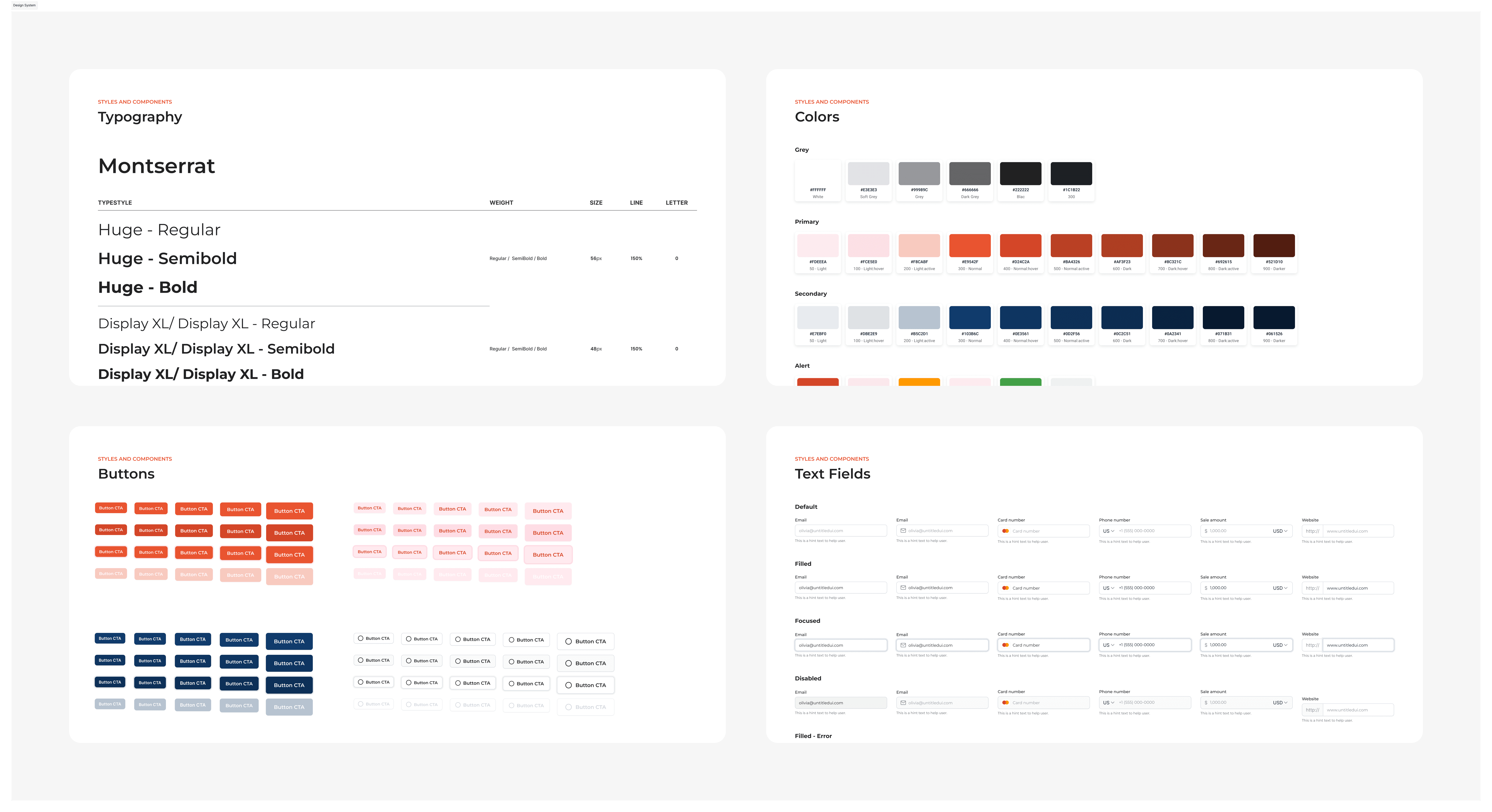
With a clear understanding of user needs, I developed a design system as the foundation for all applications. This system included:
A Unified UI Kit → Consistent colors, typography, and design components across all apps.
Standardized Navigation → A uniform navigation structure to simplify user adaptation.
Enhanced Interactions → Modern design principles to improve usability.
3. Working in Sprints & Collaborating with the Development Team
This transformation couldn’t happen in isolation. I collaborated closely with developers and stakeholders using an agile approach, ensuring each design iteration was reviewed and refined before implementation.
Key steps included:
Sprint-based Iterations → Breaking the project into smaller phases for rapid improvements.
Weekly Design Reviews → Keeping all stakeholders aligned on changes.
Prototype Testing → Engaging users in testing prototypes before full implementation.